Table of Contents
Design: Fonts
Basic Font Types (with examples)
Serif
 Serif fonts have serifs, or little lines and embellishments at the ends of the strokes of the characters. Serif fonts are more common among printed materials. Be careful about some serif fonts that have extremely thin sections, as they may not print well on low-resolution printers. Examples of serif fonts include:
- Times New Roman
- Gentium
- Newton
Sans Serif
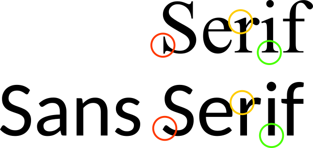 San serif fonts do not have serifs, or little lines and embellishments at the ends of the strokes of the characters. Sans serif fonts are more common among digital materials like computer and phone screens. Examples of sans serif fonts include:
- Arial
- Carlito
- Roboto
While sans serif fonts are not as popular for printed materials, sometimes they can be a better choice because the thickness of their strokes are usually uniform, and this results in a clearer result with some lower-resolution printers.
Display
Script and Handwritten
 Script fonts are usually cursive or calligraphy. Handwritten fonts can be cursive or regular letters. Both types of fonts are usually not as simple as the serif and sans serif fonts. They can be elegant or fancy and are often used in cards, signs, or possibly short Bible verses. Some can be hard to read, so use them sparingly and judiciously.
Examples of script fonts include:
Script fonts are usually cursive or calligraphy. Handwritten fonts can be cursive or regular letters. Both types of fonts are usually not as simple as the serif and sans serif fonts. They can be elegant or fancy and are often used in cards, signs, or possibly short Bible verses. Some can be hard to read, so use them sparingly and judiciously.
Examples of script fonts include:
- Alex Brush
- Chopin Script
- CurlyJoe
Examples of hand-written fonts include:
- Domestic Manners
- Always In My Heart
- Comic Sans
Decorative
List decorative fonts
Book
- Gentium Book Basic
General Rules
- Most designs look best with at least two fonts, but generally no more than two or three fonts in a document.
- Verify the license of the font, and use only fonts that are legal.
Font Pairs
If we use the same font for everything in the project, it may result in a less attractive product. On the other hand, mixing too many fonts in a project leads to a messy and unorganized feeling. Font pairs, when used in the right way, lead to a professional, clean, and attractive look. I don't know of a formula to use in choosing font pairs, but just try different fonts together and see how they look and feel. Here are a few ideas to keep in mind when choosing font pairs.
Contrast and Similarity
If you choose two fonts that are too similar, there will not be enough of a contrast between them to be visually appealing. If they are only slightly different, they may give the reader an uneasy feeling. Choose two fonts that are different, but compliment each other.
Similarity
For the text of a book where you want contrasting headings and paragraph text, try to be somewhat conservative and keep them relatively similar.
- Make sure the paragraph text is very readable (ordinary). The heading text can be
- Try using a serif and sans serif font combination.
- Font size of the heading will probably be just slightly bigger that of the paragraph.
Font Families
Investigate font families. Try using different weights, styles, and sizes within the same font family. Sometimes this will provide enough variety to be appealing.
Contrast
For a logo or image or book cover, you can be more artistically free to experiment.
- A display font or decorative font combined with a sans serif font can look nice.
- A bold font combined with a script font can look nice.
- Contrast font size. Try to make one twice as big as the other.
Distinctiveness
When you choose one font that is more distinct, it is generally best to choose a more ordinary font to match it. Because of this, these pairs do not generally go well together:
- Two script fonts
- Two decorative fonts
- A script with a decorative font
- Two display fonts
Recommended Fonts
See our Font Resources page.